1. Introduction
CSS animation refers to the technique of adding motion and visual effects to elements on a web page using CSS (Cascading Style Sheets). It allows designers and developers to create dynamic and engaging user experiences by animating various properties of HTML elements, such as position, size, color, and opacity. CSS animation offers a powerful way to bring life to static designs, making them more interactive and visually appealing.
By defining keyframes and specifying animation properties, such as duration, timing function, and delay, designers can control the movement and behavior of elements, resulting in seamless transitions, smooth transformations, and eye-catching effects. CSS animation provides a flexible and lightweight alternative to using JavaScript or Flash for creating animations, contributing to improved performance and browser compatibility.
2. Getting Started with CSS Animation
2.1 Understanding keyframes and animation properties
Understanding keyframes and animation properties is essential when creating compelling animations in CSS. Keyframes serve as the building blocks of animations, allowing you to define the different stages or frames of an animation sequence. Animation properties, on the other hand, provide control over the timing, duration, and behavior of the animation.
Keyframes: Keyframes enable you to specify the intermediate steps between the starting and ending points of an animation. By defining keyframes at various percentages or using specific keywords like “from” and “to,” you can set the values of CSS properties at different points in time. This flexibility gives you complete control over how an element transitions and transforms throughout the animation.
Animation Properties: CSS provides a range of animation properties that allow you to customize the behavior and appearance of animations. These properties include duration, timing function, delay, iteration count, direction, and fill mode. By tweaking these properties, you can determine the speed, easing, repetition, and other characteristics of the animation.
Duration defines how long the animation lasts, while the timing function determines the pace and acceleration of the animation. Delay adds a pause before the animation starts, and the iteration count controls how many times the animation repeats. Direction specifies whether the animation plays forward, backward, or alternates between the two. Fill mode determines the state of the element before and after the animation.
By mastering keyframes and understanding animation properties, you gain the ability to create mesmerizing effects and seamless transitions. Experimenting with different timing functions, durations, and keyframe positions enables you to craft animations that perfectly align with your design vision.
2.2 Setting up a basic CSS animation
Getting started with CSS animation is an exciting journey that begins with setting up a basic animation. By following a few simple steps, you can quickly bring an element to life on your webpage. Let’s dive into the process:
– Step 1: Select an Element: Choose the HTML element that you want to animate. It can be a button, a text block, an image, or any other element you wish to animate.
– Step 2: Define Keyframes: To create an animation, you need to define keyframes that specify different stages of the animation. Keyframes are defined using the @keyframes rule and consist of percentages or keywords such as “from” and “to.” Within each keyframe, you can set the values of CSS properties to create the desired effect.
– Step 3: Apply Animation Properties: Now, it’s time to apply animation properties to control the behavior of your animation. Properties like animation-name, animation-duration, animation-timing-function, and animation-iteration-count come into play here. The animation-name property links your animation to the defined keyframes, while animation-duration determines how long the animation lasts. Adjust the animation-timing-function to define the easing or acceleration of the animation, and set the animation-iteration-count to determine the number of times the animation repeats.
– Step 4: Trigger the Animation: Finally, you need to trigger the animation by applying the appropriate CSS property to your selected element. Commonly used properties include animation or its individual counterparts like animation-name, animation-duration, etc. This tells the browser to animate the specified element using the defined keyframes and properties.
– Step 5: Preview and Refine: Test your animation in a browser to see the results. If necessary, fine-tune the keyframes and animation properties to achieve the desired effect. Experiment with different values, durations, and timing functions to unleash your creativity.
By following these steps, you can create a basic CSS animation that brings your chosen element to life. As you become more comfortable with the process, you can explore advanced techniques, combine multiple animations, and incorporate interactivity to create even more engaging experiences.
2.3 Some basic CSS animation examples
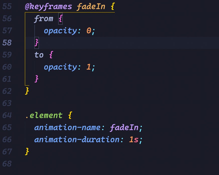
Example 1: Fading In an Element
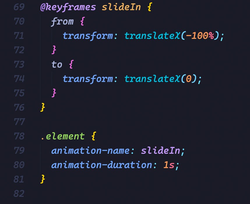
Example 2: Moving an Element Horizontally
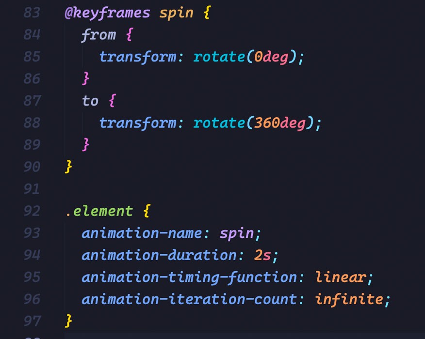
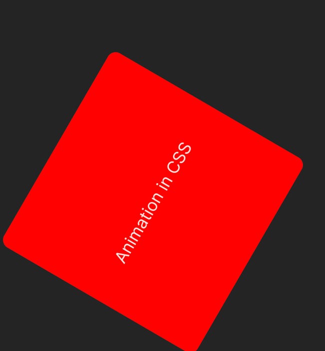
Example 3: Rotating an Element:
These examples showcase different types of animations. In Example 1, the element gradually fades in by animating the opacity property.
Example 2 demonstrates how an element can slide in horizontally using the transform property. Lastly, Example 3 rotates an element continuously using the transform property and sets the animation to repeat infinitely.
3. Transition Animations
Transition animations are a fundamental aspect of CSS animation that allows for smooth and elegant transformations between different states of an element. In this section, we will explore the concept of transition animations, the CSS properties involved, and how to create engaging hover effects using transitions.
3.1 Introduction to transition animations
Transition animations provide a straightforward way to animate changes in CSS properties smoothly. They enable you to define the transition of one or more properties from an initial state to a final state, with the browser automatically handling the intermediate steps. By specifying the duration and timing function, you can control the speed and easing of the transition.
3.2 Transitioning CSS Properties
CSS properties suitable for transition animations include color, background color, opacity, width, height, transform, and many others. By transitioning these properties, you can create visually appealing effects, such as fade-ins, color changes, resizing, and transformations.
To apply a transition to an element, use the transition property, specifying the CSS properties you want to transition, the duration, and the timing function. For example:
This code sets the opacity property of the element to transition over 0.5 seconds with an ease-in-out timing function.
3.3. Creating Hover Effects with Transitions
One of the most common uses of transition animations is to create hover effects that add interactivity and feedback to user interactions. By applying transitions to properties like background color, opacity, or transform, you can smoothly change an element’s appearance when a user hovers over it.
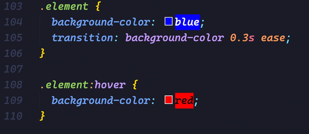
Here’s an example of a simple hover effect that transitions the background color:
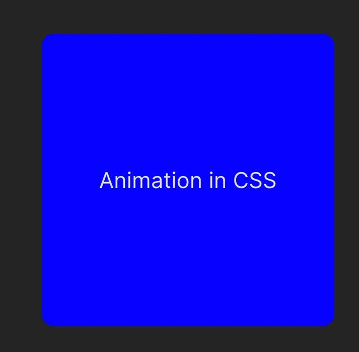
In this code snippet, when the mouse hovers over the element, the background color smoothly transitions from blue to red over 0.3 seconds with an ease timing function.
By combining transitions with other CSS properties and selectors, you can create a wide variety of engaging and interactive hover effects.
4. Keyframe Animations
Keyframe animations are a powerful technique in CSS animation that allows for precise control over each step of an animation sequence. In this section, we will explore keyframe animations, how to define and use them, and how to control animation duration, delay, and iteration.
4.1. Understanding Keyframe Animations:
Keyframe animations involve defining specific stages or keyframes at different points in time during an animation. Each keyframe represents a snapshot of how the animated element should appear at that particular moment. By specifying these keyframes and their associated CSS properties, you can create complex and dynamic animations with precise control over each step.
4.2. Defining and Using Keyframes:
To define keyframes, you utilize the @keyframes rule in CSS. Within the @keyframes rule, you specify the percentage or keywords (e.g., “from” and “to”) representing the progression of the animation. Inside each keyframe, you set the values of CSS properties to achieve the desired effect.
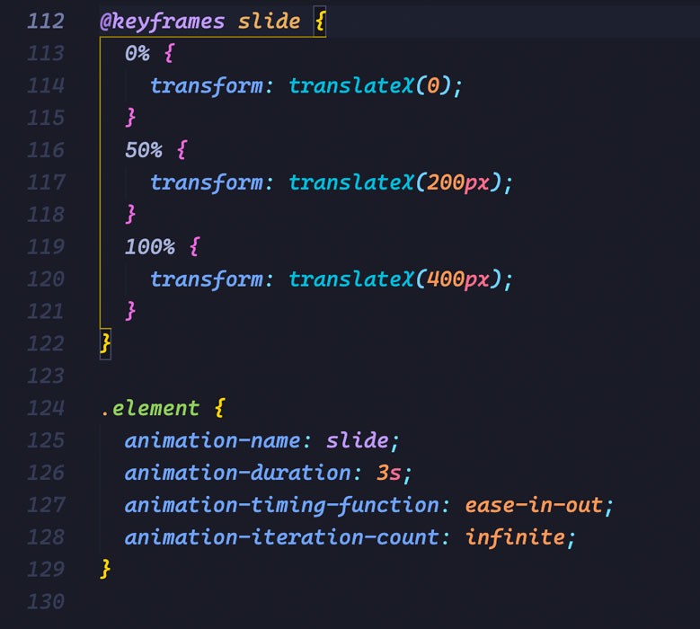
Here’s an example of a simple keyframe animation that moves an element horizontally:
In this code snippet, the element gradually moves from the initial position to the right by applying the translateX() transform function at different percentages of the animation duration.
4.3. Controlling Animation Duration, Delay, and Iteration:
CSS provides several animation properties to control the timing and behavior of keyframe animations. The animation-duration property determines how long the animation lasts, while animation-delay introduces a pause before the animation begins. The animation-iteration-count property specifies the number of times the animation should repeat, and you can use values like infinite for indefinite repetition.
Additionally, you can adjust the animation-timing-function property to change the pace and easing of the animation. Values like ease, linear, and ease-in-out modify the timing behavior, allowing you to achieve smooth, snappy, or custom easing effects.
By manipulating these animation properties, you can fine-tune the duration, delay, iteration, and easing of keyframe animations, resulting in captivating and dynamic visual effects.
5. Animation Libraries and tips
Animation is a powerful tool in CSS that allows web designers to bring life and interactivity to their websites. While CSS animations can be created from scratch, there are several animation libraries and tools available that simplify the process and offer pre-built animations and effects. In this section, we will explore some popular animation libraries and tools that can enhance your CSS animations.
5.1 Popular Animation Libraries
Two popular choices are Animate.css and GreenSock.
Animate.css is a lightweight library that offers a collection of CSS animations. It provides a simple way to add animated effects to your web pages without writing complex code. With Animate.css, you can easily apply animations such as fade-ins, slide-ins, and bounce effects to various elements. The library is well-documented and easy to use, making it a favorite among developers who want to quickly add animations to their projects.
GreenSock, also known as GSAP (GreenSock Animation Platform), is a robust animation library that offers advanced features and unparalleled performance. It provides a comprehensive set of tools for creating complex animations and effects. GreenSock allows you to animate not only CSS properties but also SVG, canvas, and even custom JavaScript objects. Its timeline-based approach gives you precise control over the timing and sequencing of animations, making it a go-to choice for professional animators and developers.
5.2 Personal tips
5.2.1 Create scroll animation with Framer motion
Framer Motion allows you to easily animate elements on your web page by defining animations using a declarative syntax. With Framer Motion, you can apply smooth transitions, create complex keyframe animations, and even orchestrate intricate animation sequences. It provides a simple and intuitive API that abstracts away the complexity of CSS animations, making it accessible to both beginners and experienced developers.
– Using scroll animation in Framer-motion:
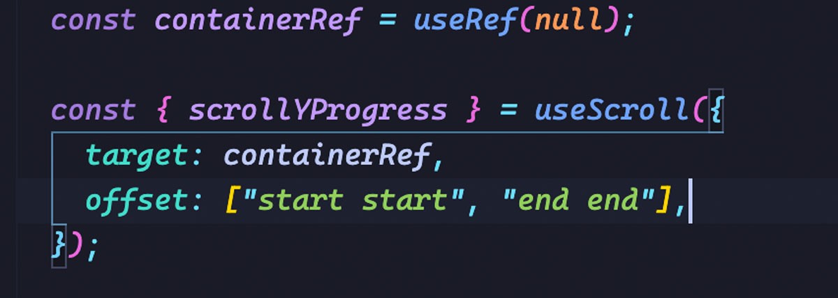
– Example code: Setup container:
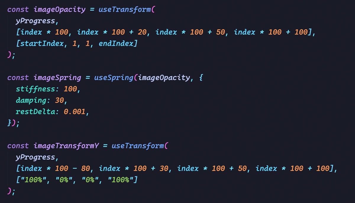
Setup images opacity and images transform:
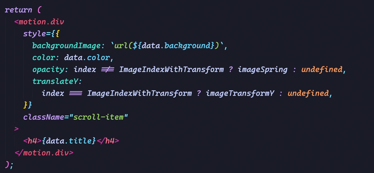
Render image cards:
We supposed that each card item has 100 units to show (opacity and transform).
Please read the full flow in the source code.
This is the result:
Please see the full flow in the video demo.
Another advantage of Framer Motion is its extensive documentation and active community. The documentation provides comprehensive examples, guides, and API references, making it easy to get started and explore the library’s capabilities. Additionally, the community around Framer Motion is vibrant, with developers sharing their creations, tips, and tricks, which can serve as a source of inspiration and learning.
If you’re looking to take your CSS animations to the next level, Framer Motion is a valuable tool to have in your arsenal. With its intuitive API, physics-based animations, support for gestures, and seamless integration with React, Framer Motion empowers you to create rich and immersive animations that bring your web projects to life. Give it a try, and unlock a world of possibilities for your animations.
5.2.2 -webkit-mask property
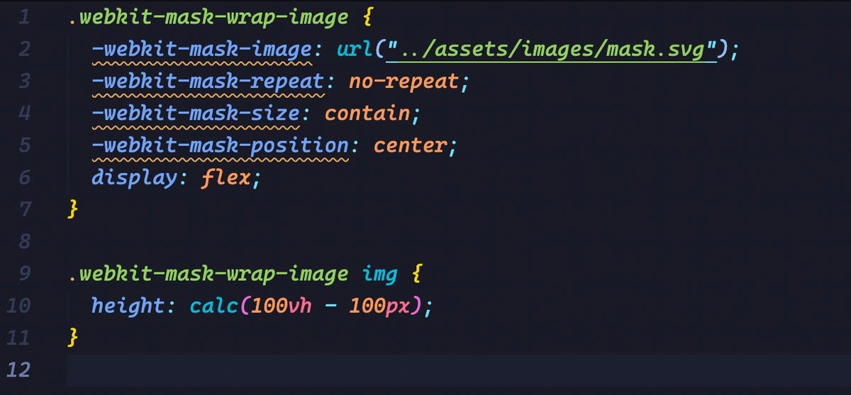
The -webkit-mask property is used together with an image or gradient to create a mask effect on an element. The mask image or gradient is applied to the content of the element, allowing only certain parts of the content to be visible based on the alpha channel values of the mask.
Example code:
Webkit mask result with the mask image:
In the example above, the URL (mask-image.svg) specifies the image file that will be used as the mask for the element. Only the areas of the element that correspond to the non-transparent parts of the mask image will be visible.
5.2.3 -webkit-font-smoothing property
The -WebKit-font-smoothing property is a CSS property specific to WebKit-based browsers, such as Safari and older versions of Chrome. It is used to control the antialiasing and rendering of fonts on a web page.
This property allows you to specify the level of antialiasing to be applied to the text, making it appear smoother or crisper. The available values for -webkit-font-smoothing are:
auto: This is the default value. It lets the browser decide the antialiasing method for the text.
none: Disables antialiasing for the text, which can result in a pixelated appearance.
antialiased: Applies standard grayscale antialiasing to the text, making it appear smoother.
subpixel-antialiased: Uses subpixel rendering to antialias the text, which can result in a slightly crisper appearance. This is especially noticeable on high-resolution displays.
6. Conclusion:
In conclusion, CSS animation is a powerful tool that allows developers to bring websites and web applications to life. It offers a wide range of possibilities for creating engaging and interactive user experiences. By leveraging CSS properties such as @keyframes, transition, and transform, developers can manipulate various elements, from simple transitions and transformations to complex animations.
Animation in CSS not only enhances the visual appeal of a website but also improves usability and user engagement. It enables smooth transitions, eye-catching effects, and delightful interactions that can captivate users and make their browsing experience more enjoyable.
Saigon Technology has over a decade of experience developing web apps. We craft robust, innovative apps that make our clients stand apart. Let’s discuss how we can help you succeed.


